Cross-Team • Brand • Interaction Design • Responsive Design
Academia Design System
Cross-Team • Brand • Interaction Design • Responsive Design
Drawing inspiration from our mobile app projects, we saw a clear need for more organized and consistently implemented designs. As the system's manager, I led the visual direction, facilitated collaboration among teams, and set up the system as the definitive 'source-of-truth' through version control in Figma.
In bi-weekly meetings with front-end engineers, visual designers, and engineering managers, we discussed the implementation of components identified during design critiques. This process was crucial for addressing discrepancies, such as different navbar designs or specific button functionalities, and for developing scalable and extendable components that were practical for front-end implementation.
Team Composition
1 Lead Designer
2 Visual Designers
1 Lead Front-End Engineer
2 Front-End Engineers
Results
Accessible button states, type, & color systems.
Single source-of-truth for reference by full-stack engineers
Unified across responsive desktop experience, native iOS & Android platforms
Button grid, featuring all states of buttons
Text styles used in components throughout the site
Banner designs for high-priority messaging
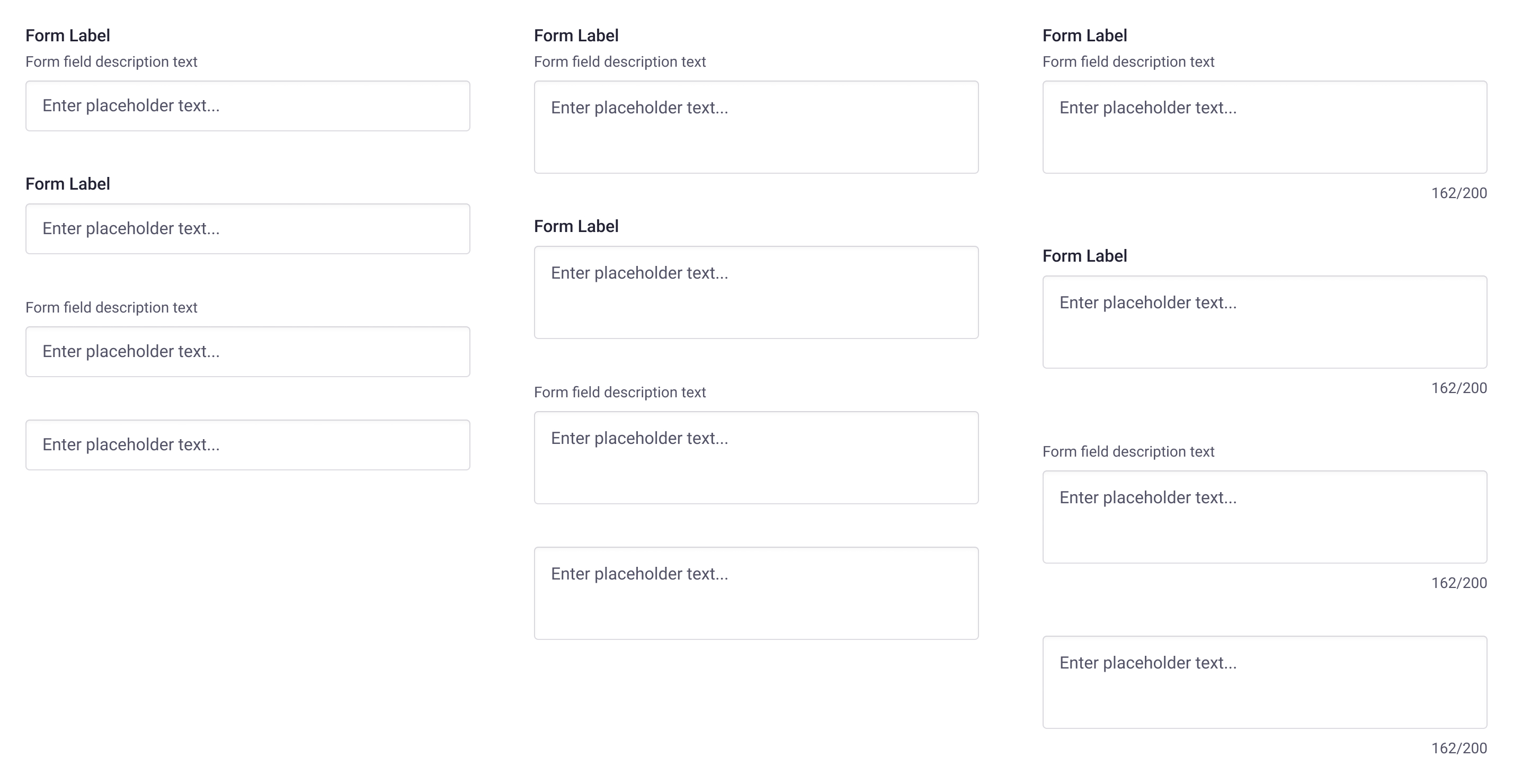
Input fields and forms
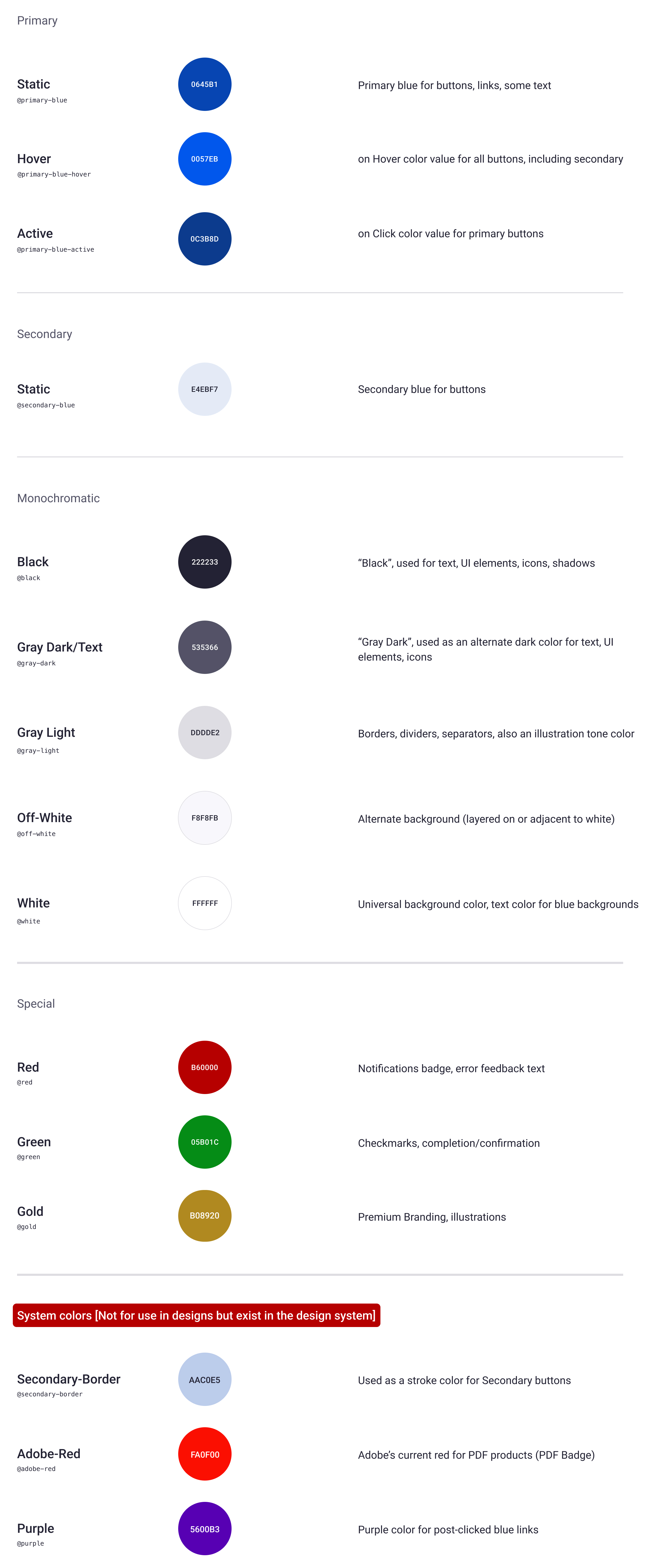
Color system, with use-cases specified
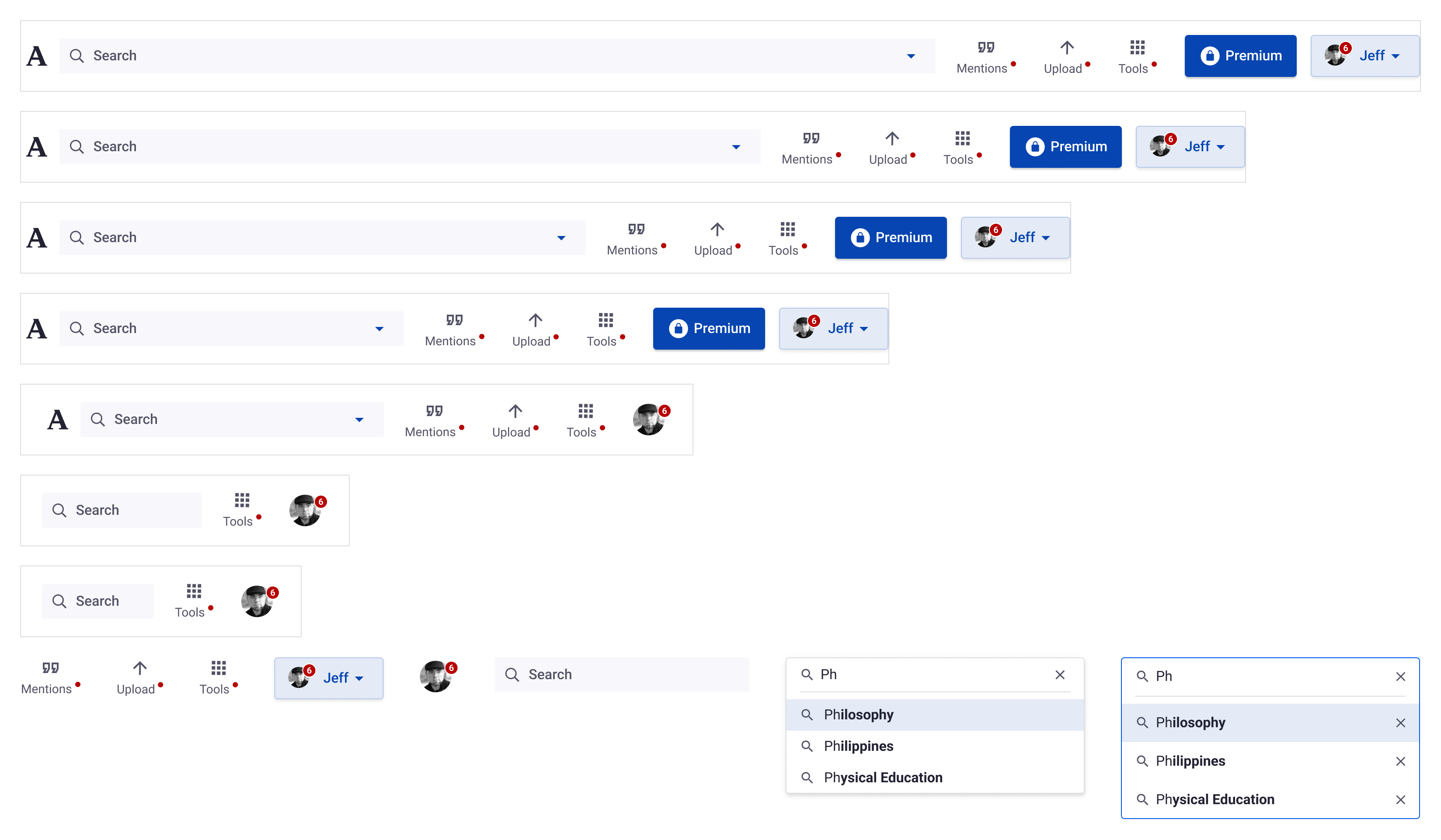
Example of navbar components and subcomponents used across desktop and responsive experiences.
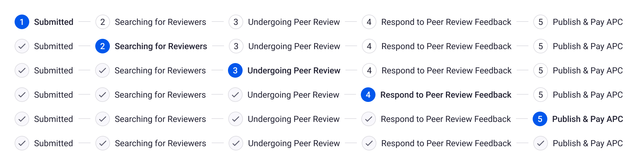
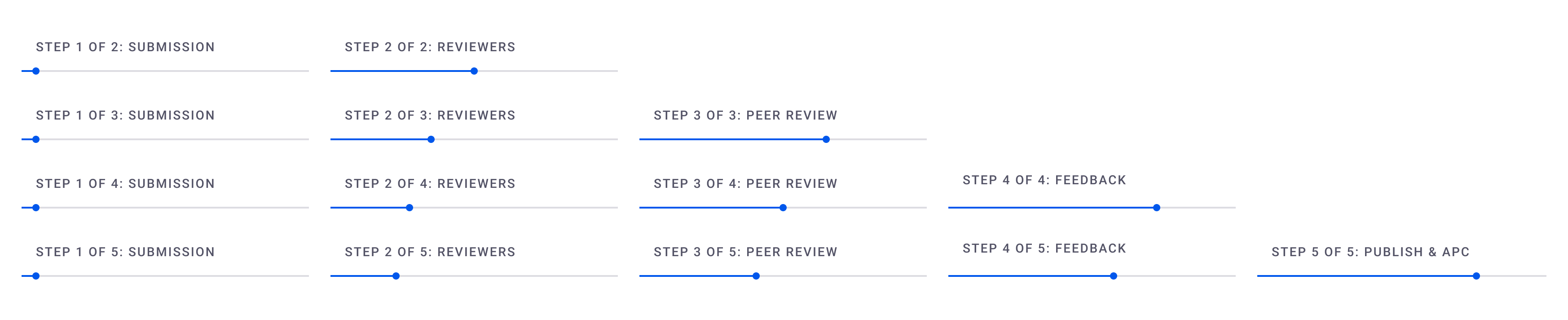
Progress indicators, desktop & mobile
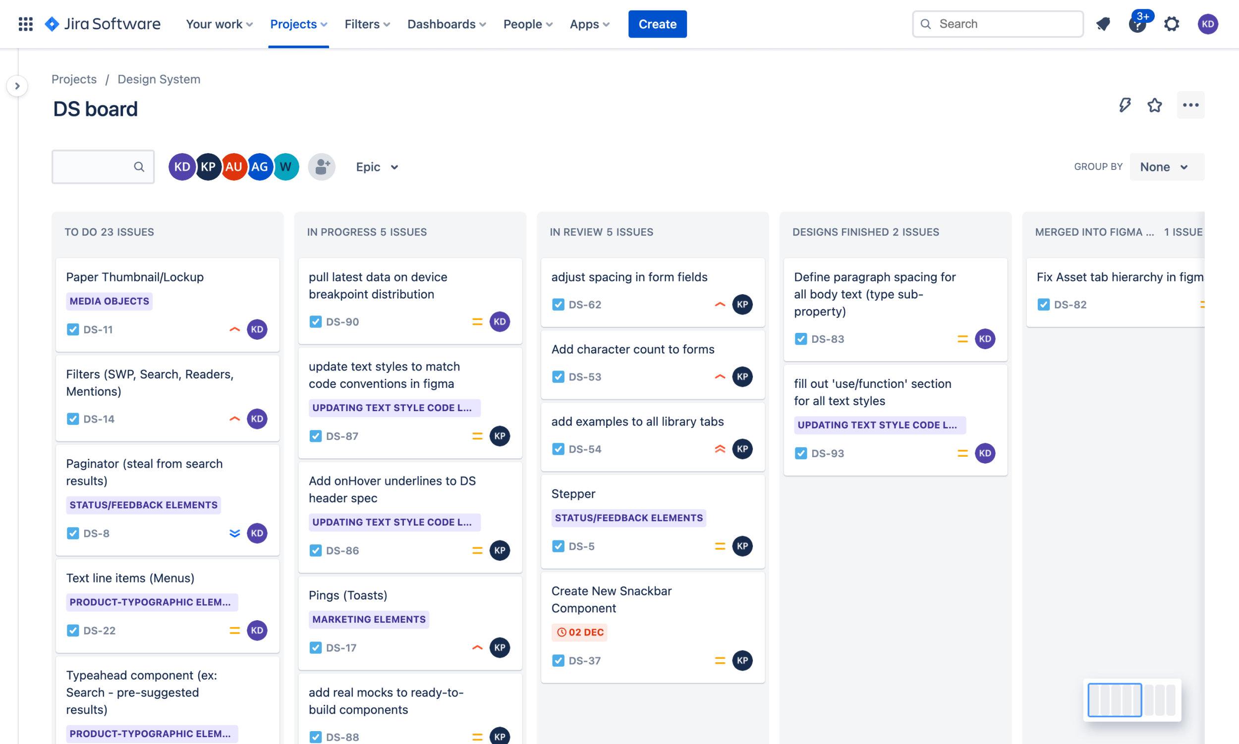
Screenshot of the kanban task board, for various components to componentize.